QR Code Landing Page: How to Build One for Guests
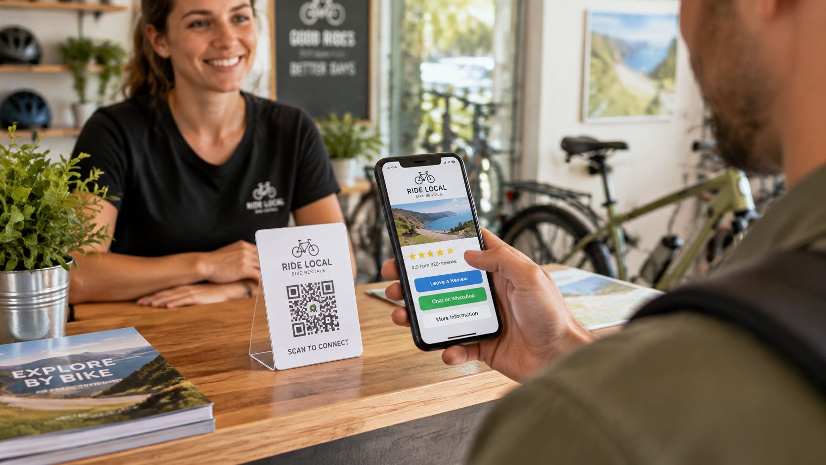
The bikes are back at the counter, the boat is tied up, or the bill has just landed on the table. The guest's phone is already out. A long web address on a sign will not get typed. A QR code landing page will.
That page is the short stop between a paper code and the next useful action. It can open a review form, a WhatsApp chat, the house rules, or tomorrow's meeting point. The same printed code serves a neighbour and a visitor whose phone is set to another language.
It also has two quieter jobs. Guests need to trust the screen they land on. The invitation to review has to reach every guest, with no reward and no filter.
What a QR Code Landing Page Does for Guests
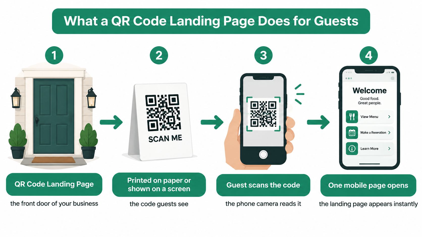
A QR code landing page is the front door of the business, printed on a card or shown on a screen. The guest scans the code with the phone camera, and one mobile page opens in the browser. There is no app, no account, and no address to type.
The page has three jobs. It shows the guest they are in the right place. It offers the next action, such as a review, a WhatsApp message, or the house rules. It answers the question that brought them there.
Take a bike rental counter. The rider has just returned the bikes and is paying. A small card sits by the till. The guest scans it, sees the shop logo, taps the review button, and walks out. The phone was already in hand. A printed sign alone cannot hold live links.
Many international guests already know this action. A 2024 study of smartphone users aged 16 and older found that 50.8% worldwide scanned a QR code monthly, including 35.8% in the United States, as reported by My Sin Chew.
One code, one editable page, many uses.
Elements Every Mobile Landing Page Needs
Six elements cover what a rental desk, a tour meeting point, or a restaurant table needs. Anything beyond this list starts to compete with the tap the guest came to make.
| Page element | What the guest does | Example |
|---|---|---|
| Business name and logo | Sees they are in the right place | Bike shop logo above the review buttons |
| Google, Tripadvisor and Facebook buttons | Taps once to reach the review window | Review button opens the form, not the profile |
| WhatsApp button | Asks a question or makes a booking | Boat rental receives booking questions directly |
| Practical information | Finds opening times, rules or routes | Tour meeting point and house rules |
| Website link | Opens the full website | Restaurant menu page |
| Language handling | Reads labels in their phone language | Visitor from abroad sees the buttons in their own language |
A page written only for local guests will lose a visitor who cannot read the labels. The name at the top is the trust check. The review and WhatsApp buttons are the actions. The rest is reference.
- Keep the list short. Extra buttons make guests hunt.
- Put review and contact actions above the fold. The first screen should show them without a scroll.
- Group practical information under one clear label. Opening times, rules, and routes belong together.
Ask someone who doesn't know the business to scan the code and, within ten seconds, say what to tap next. If they can't, cut choices or rewrite the labels. A QR code with multiple links can hold those destinations on one page, so the counter doesn't collect a pile of separate codes.
Build Your Page and Put the First Code Out Today
The first code doesn't need a designer or a print run. It needs a correct page, a phone test, and a spot where guests already have a phone in hand.
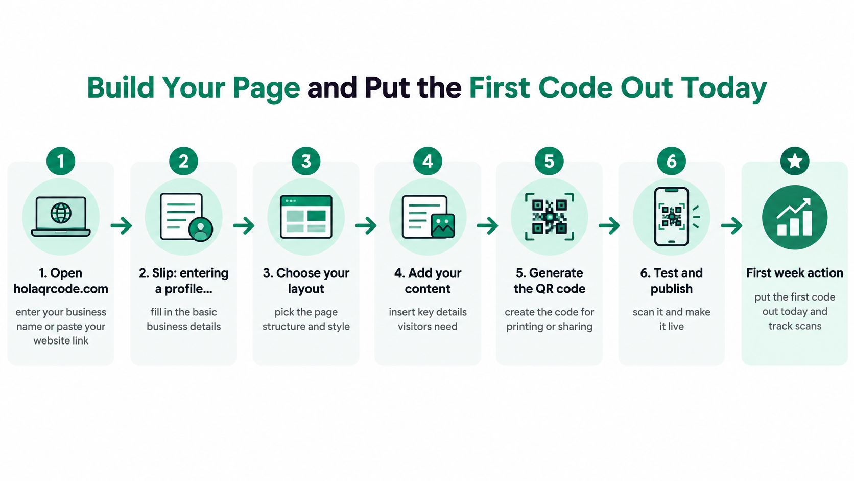
Open the page and check every button
- Open the HolaQR site and enter the business name, or paste the business website. A Linktree link also works, and the existing links come across. The usual slip is pasting a Google or Tripadvisor profile instead of the business's own site. If the business isn't found, the owner fills the links in, which takes about a minute. No account is required to start.
- Check the logo, the review links, and the contact details the page shows. The name and logo sit at the top so guests know the place. Fix a wrong Google listing before anyone scans. One tap on Google, Tripadvisor, or Facebook should open the review window, not a profile page to search through.
- Add the practical links guests ask for most: the menu, the rental route, the house rules, and WhatsApp. Questions and bookings then go straight to the business, with no booking-platform commission. Guests find the answer without stopping the person at the counter.
- Preview the page on a phone, tap every button, and open it in a second language if one is available. Testing only on a computer misses overflow, tiny type, and buttons that sit too low.
Put the code where the phone is already out
- Download the printable file. A sticker suits a bike, a helmet box, or a boat. A counter card or table card suits a desk. Nothing has to be printed on day one. Guests can scan the code on the owner's phone screen.
- Place the code where a phone is already out: checkout, the boat handover, or the table when the bill arrives. A code by the door fails when the phone is still in a pocket. The useful moment is payment or the return of the kit.
Cost, and a fair look at other tools
HolaQR is a free QR review page that shows itself in each guest's phone language, with direct review buttons and a code that never expires. The page, the code, and the printable files are free, scans aren't capped, and a credit card isn't required. Free pages show a small "made with HolaQR" line at the bottom. Read that line before a sticker goes to print.
Tools already in use may do part of this job. Compare three things side by side before switching: whether review buttons open the form directly, whether labels follow the guest's phone language, and whether a sticker or counter card is included. A tool that only makes a code, with no page behind it, still leaves the guest on a crowded website.
A five-minute check
Scan the new code on a phone and tap every button. Confirm the review window, the WhatsApp chat, and one practical link. If a button opens the wrong place, fix it before the card reaches the counter.
Keep the Page Fast and Clear in Every Language
Speed decides whether the guest taps at all. Scans happen on phones, often on weak mobile data at a harbour, a trailhead, or a crowded terrace.
Google's analysis of about 11 million mobile pages found that raising load time from 1 to 10 seconds increased the predicted probability of a bounce by 123%. The same analysis linked a jump from 400 to 6,000 page elements with a 95% decline in conversion probability. A usable target is about 3 to 5 seconds on a constrained connection. Google recommends 5 seconds or less on 3G.
Trims that keep the first screen usable
- Compress images and use one logo file.
- Keep scripts light and limit third-party trackers.
- Place review buttons near the top so the first paint already offers an action.
Time the path from camera scan to a button the guest can tap. A fast server response doesn't help if the button appears late. On the phone, check how long the page takes to look ready, and how long a button takes to respond to a tap.
One vocabulary in every language
Use a short, consistent set of labels: Review, WhatsApp, Menu, and Rules. Keep the business name unchanged. Check a long-text language so a label doesn't spill out of the button. Keep the same button order in every language, so the layout is learned once.
Automatic language detection helps, and it isn't enough. Guests share phones, use browser translation, or keep a phone language that isn't the one they read best. Offer a fallback language when the phone language isn't supported.
Scan once on mobile data, then again on a second phone set to another language. Thirty seconds shows both problems.
Printing Codes That Scan Reliably
A printed code has to survive handling, glare, and resizing. ISO/IEC 18004 sets four Reed-Solomon error-correction levels and requires a clear quiet zone on all four sides.
| Level | Codewords recovered | Best use |
|---|---|---|
| L | about 7% | Clean indoor displays printed at a large size |
| M | about 15% | Indoor cards kept away from handling |
| Q | about 25% | Stickers, table cards and outdoor material |
| H | about 30% | Items that get handled, folded or partly covered by a logo |
Higher correction tolerates scratches, folds, and a small central logo. It also needs a larger symbol for the same data. Decoration that eats the pattern will fail in sunlight.
- Encode a short HTTPS link, not a long address full of parameters.
- Leave the quiet zone empty on all four sides. No border, no text, no colour bleed.
- Keep strong contrast. A dark code on a light background. Not a light code on a coloured one.
- Choose Q or H for stickers, table cards, and outdoor material.
- Print at the final size guests will see, then scan with several current phones from the distance they will stand.
- Keep any logo small and centred only if those test scans still pass.
Error correction cannot fix blur or a low-resolution print. If the modules look soft on paper, reprint sharper rather than raising the correction level. A short guide to branding QR codes covers logo size and contrast before a large sticker order.
Changing the links on the page doesn't change the QR code, so stickers and flyers keep working. Staff can update review links, menus, and contact routes without a reprint.
Review Links That Follow Google and Tripadvisor Rules
The common mistake is asking only the guests who look pleased. That is review gating, and both major platforms ban it. The safe process is dull on purpose: invite every guest, reward nobody, and let each guest choose the rating and the words.
Google's content policy prohibits businesses from selectively asking only for positive reviews. It also bans payments, discounts, free goods, or services in exchange for posting, changing, or removing a review. Google treats that as rating manipulation, and violating content may be removed. Tripadvisor's trust rules ban any reward for a review, positive or negative, including free drinks, discounts, contest entry, upgrades, and vouchers. Tripadvisor's review guidance says affected reviews can be removed and a business may lose eligibility for Tripadvisor awards.
| Practice | Allowed | Why |
|---|---|---|
| One neutral QR code at check-in or checkout | Yes | Every guest gets the same invitation |
| Wording such as "Share your experience" | Yes | Invites honest feedback without steering the rating |
| Discount or free drink for leaving a review | No | Google and Tripadvisor ban rewards for reviews |
| Asking only guests who seem happy | No | Selective requests count as review gating |
| Different review links based on guest mood | No | Routing by mood breaks the equal-invitation rule |
| Same invitation for every guest | Yes | Keeps the process neutral and compliant |
- One code at check-in, checkout, a boat handover, or the table.
- Neutral wording, such as "Share your experience", not "Give us five stars".
- The same invitation for every guest. No second link for guests who seem happy.
- No trade if a guest is unhappy. Reply, and fix the problem. Never offer anything for changing or removing a review.
A practical walk-through of how to ask customers for Google reviews stays on this neutral path. The QR page doesn't filter guests or control ratings. The guest chooses the stars and the words.
Trust Checks That Stop QR Phishing
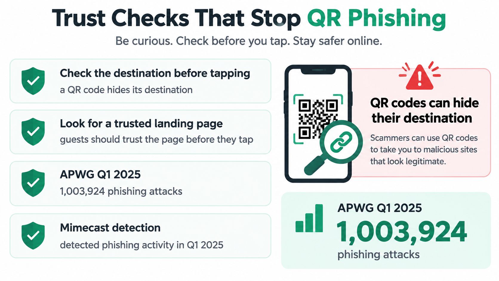
A QR code hides its destination. Guests have to trust the page before they tap a review button, a chat, or anything that looks like payment. Hospitality codes sit on tables, boats, and walls, outside a controlled website, so the page itself is the checkpoint.
The APWG phishing trends report for Q1 2025 recorded 1,003,924 phishing attacks. Security researchers keep turning up malicious QR codes in growing numbers, and many people never suspect a printed square can lead to a fake site. That gap between how common the trick is and how few guests expect it is why a printed code needs visible checks around it. Trust cues also protect review volume: a guest who doubts the code never reaches the review window.
Before the scan
- Tamper-evident print. A sealed sticker shows if someone has stuck a new code on top.
- A sign that names the business beside the code, so a swapped sticker stands out.
- One plain line stating where the code leads, such as reviews, WhatsApp, and house rules.
After the scan
- Name and logo at the top, on the business's own address.
- No card number, password, or payment requested on that page.
- Contact details visible, and each button labelled with where it goes.
Payment details deserve the plainest treatment. A guest who can read a price in text and compare it with the page behind the code has a way to spot a bait-and-switch. Show prices and payment details in plain text. Don't ask guests to pay through a scanned code.
After every edit, open the live page and check it. Limit destination changes to trusted staff. Remove any unknown code that appears on a table, a wall, or a menu. Changing the links on the page does not change the printed code, so a regular visual check is what keeps old stickers honest.
If a guest would be surprised by the next screen, change the page.
Open HolaQR, type the business name, and check the logo, the review buttons, and WhatsApp before the next checkout. No account and no credit card are required. Show the code on a phone today, or print the sticker or counter card once every button opens the right place.