Review Cards for Customers: How to Place and Print Them
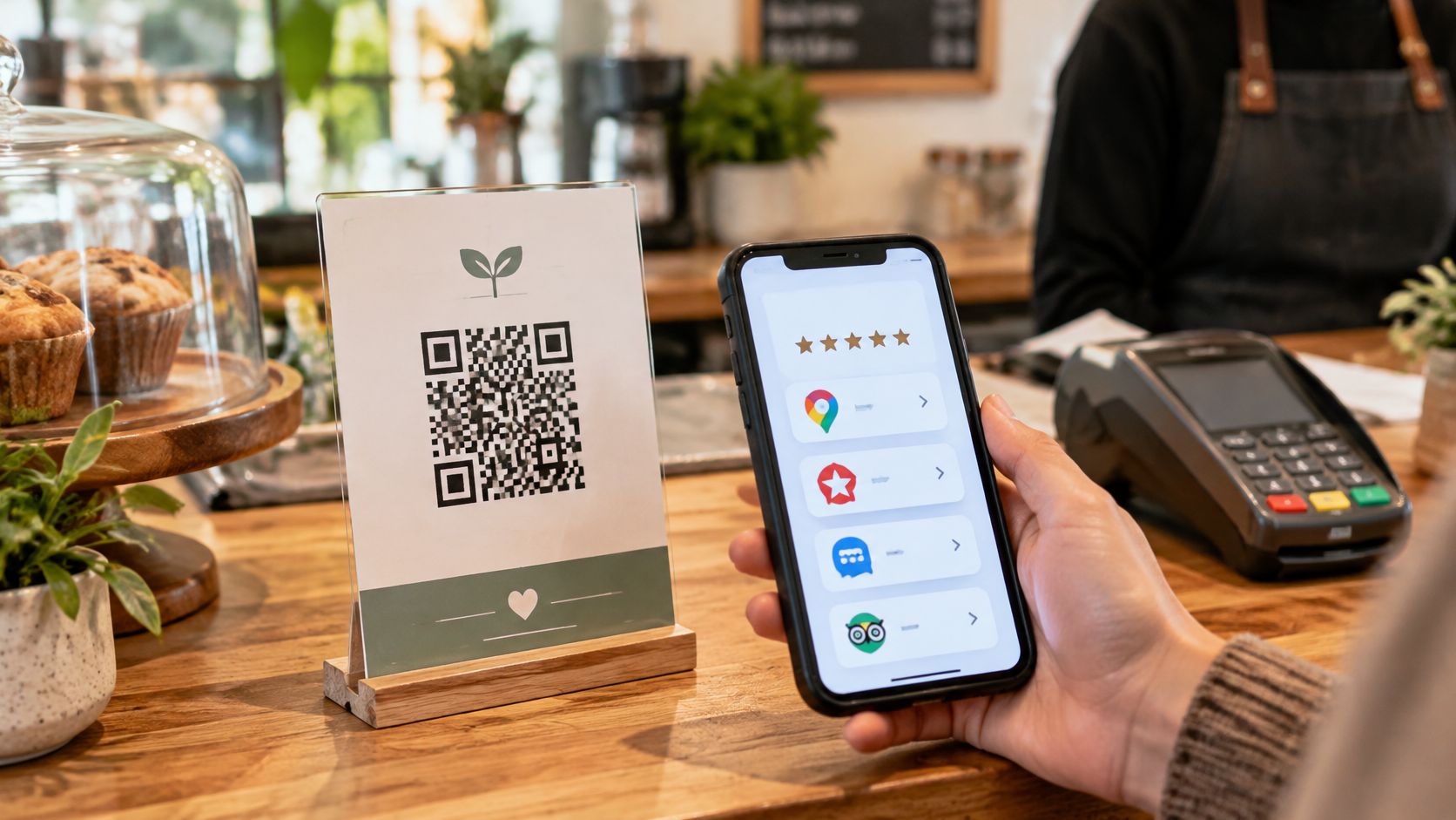
"Best meal of the trip," the guest says, already reaching for the car keys. Two minutes later the table is cleared and the compliment is gone with it. Nothing went wrong, and that is the problem: a satisfied guest has no reason to think about your business again until the next holiday.
That gap costs more than a missed thank-you. Research on online reviews suggests that review volume shapes purchase decisions, and that a negative emotional tone weighs heavily on them. Future guests read what past guests wrote. When nobody writes, the next booking goes to whichever business left the longer trail.
A review card closes that gap. Put one where the guest already stands, with a QR code that opens a page of review buttons, and the compliment heading for the car park has somewhere to go. Treat it as a request tool rather than a growth hack. Three things decide whether it works: where the card sits, the moment you point to it, and the words printed around the code. The wording matters for a second reason too. Google and Tripadvisor allow you to ask guests for reviews, but they come down hard on rewards and on cherry-picking which guests get asked. The card has to pose the same neutral question to everyone and let the rating say whatever the guest thinks.
Get those things right and the card earns its spot on the counter. Get them wrong and it becomes one more sticker guests walk past.
Why Guests Forget to Leave Reviews
The guest who just handed back the bike meant to leave a review. They liked the route map, the brakes were sharp, the person behind the counter was helpful. Then the car started, the phone went into the cup holder, and the intention dissolved. A guest with a good experience has no reason to think about it again until the next holiday.
Review readers don't stop at one platform. BrightLocal's 2024 Local Consumer Review Survey found that 36% of consumers use two review sites when deciding whether to use a local business, while 41% use three or more (BrightLocal). A business that's strong on Google and invisible on Tripadvisor covers part of that search and loses the rest. One card that opens a page with several review destinations lets each guest pick the platform they already use, instead of hunting for the business by name.
Recency makes it worse. The same survey reported that 27% of consumers say reviews posted in the previous two weeks influence their decisions, up from 22% in 2022. A steady trickle beats a burst of reviews from three summers ago.
So define the tool plainly. A review card is a sticker, counter card, table card or folder insert carrying one QR code. The code opens a mobile page with review buttons, a WhatsApp route and the details a guest might need. Nothing to install, nothing to type.
"They scan it while they hand back the bike. By the time I've hung up the helmet, the review is in." Marco, rental operator
That's the whole mechanism. The card doesn't persuade anyone. It removes the search, and the search is where most good intentions die. The decisions worth getting right are placement, design, setup, wording, timing and measurement.
Where to Place Review Cards in Your Business
Placement decides more than design does. A beautiful card taped inside a window gets scanned by nobody. A plain card propped against the card reader gets scanned by half the queue. Match the format and the spot to the moment a guest is still holding a phone and still inside the experience.
| Business | Placement | Best moment | Card format |
|---|---|---|---|
| Bike or boat rental | Return counter and equipment tag | When keys or equipment are handed back | Counter card and equipment sticker |
| Tour or activity | Meeting point desk and welcome folder | At drop-off after the tour | Table card or folder insert |
| Restaurant or café | Table and bill folder | With the bill | Table card |
| Bar or beach club | Bar counter and lounger tags | Before guests leave the area | Sticker and table card |
| Holiday home or B&B | Welcome folder and fridge magnet | Check-out morning | Welcome folder insert |
| Hotel | Check-out desk and room folder | At check-out | Counter card and room card |
| Salon, spa or shop | Checkout counter and receipt holder | At payment | Counter card or sticker |
The logic behind every row is identical. Put the card where guests already pause and already have a phone in hand: the return counter, the payment point, the welcome folder, the check-out desk. One card at each exit point beats three cards crowded into one spot, because guests leave by different doors.
Three habits that keep cards working
- Keep it at eye level. A card lying flat on a counter is read as clutter. A card on a small stand or taped at eye height next to the card reader gets noticed without a word from staff.
- Keep a spare near the exit. Cards get picked up, bent and taken home. A second copy behind the till means you never run dry mid-afternoon.
- Check stock every week in season. A faded, curling card signals a business that stopped caring in June.
- Use equipment tags where gear is handed out. A sticker on a helmet, life jacket or paddle board works for operators who collect the item back, because the guest reads it twice.
The printed code never has to change. Update the links on the page and every card already in circulation points to the new destination.
Design a Card Guests Scan in Seconds
A card has one job at three paces: make a stranger understand what to do without reading a paragraph.
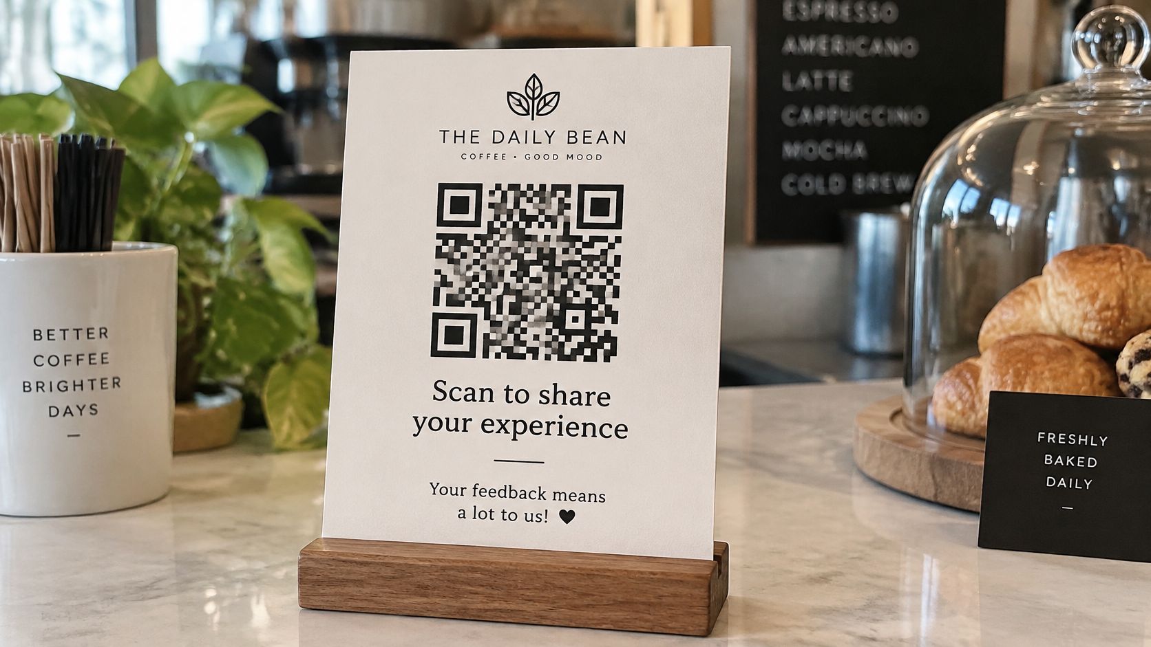
Build it in four parts, in this order.
- Logo and business name at the top. The guest must know instantly that this card belongs to the business they just paid. No logo file smaller than the card's headline can carry.
- One QR code in the centre, printed at least about 2.5 cm (1 inch) square. Bigger is better on a table card. One code, not three. Three codes make people choose, and choosing is friction.
- One short line saying what the code does. Something plain, like "Scan to leave a review or contact us". It tells the guest the destination before they commit. The invitation wording itself comes later, so keep this line neutral for now.
- A small contact line for WhatsApp questions and bookings. Guests who want to ask something before they review need somewhere to go.
Choose the format for the surface. A sticker suits equipment and fridge doors. A counter card suits a desk where someone stands. A table card suits a meal. A folder insert suits a holiday home where nobody is standing at a desk at all. HolaQR offers a printable sticker and a counter card, with the files sized when you're ready to print.
Then run a size test. Print one card, scan it from arm's length, scan it while standing exactly where the guest will stand, and repeat in dim evening light and in bright sun. If it fails once, enlarge the code before you print two hundred.
The language note
The page behind the code opens in the guest's phone language, so a plain scan line works for visitors from most countries. Add a small phone-and-QR icon anyway. A guest who doesn't read English recognises the symbol instantly, and recognition is what gets the phone out of the pocket.
One design everywhere, so guests learn what the sign means. Use the same colours and layout as the rest of your signage, following the branding rules for QR code pages. The habit is already there: in a 2024 TEAM LEWIS survey of 1,000 U.S. adults, 68% said they had used a QR code in the past year, rising to 83% among Gen Z respondents (QR Code Chimp summary).
How to Set Up Your Page and Print Materials
Setup is a single sitting, not a project. Work through the six steps below in order and don't print anything until the last one passes.
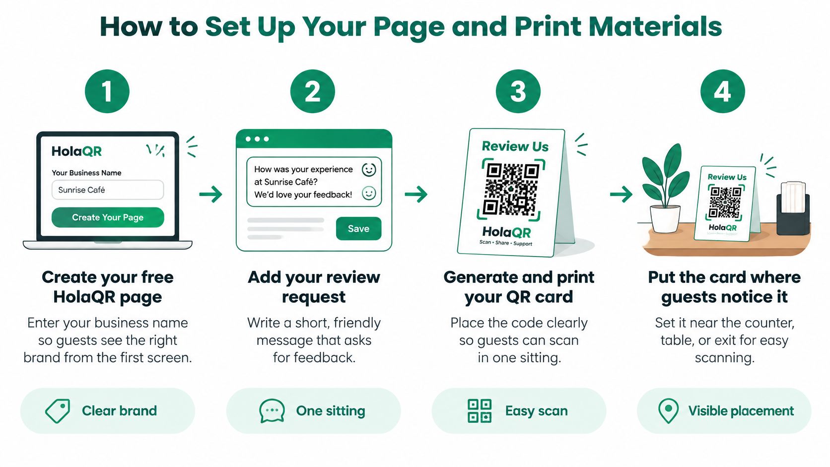
- Create the page and enter the business name. Guests must see the right brand from the first screen. The common slip is a typo in the business name that then prints on every card, so read it twice before export.
- Add a review link for each platform you use. Google and Tripadvisor are the two that matter for international visitors, with Facebook for local regulars. Each button must open the review window, not a profile the guest has to access. A missing Tripadvisor link is the usual gap.
- Add your own links. The menu, rental routes, house rules, local tips, opening hours. Guests answer their own questions, which cuts the same four emails from your day. An old menu link left in place is the standard mistake.
- Open the page on your phone and read it the way a guest from abroad would. You see what they see, including anything that reads oddly to someone outside the country. Checking only on a desktop hides most of this.
- Scan the code with your own camera and confirm it opens in the browser. No app, no account, no download prompt. Test the live page, not a saved draft.
- Print the card with your logo and business name on top, using the sizes from the design section. A clear print is the difference between a scan and a miss. The logo file being too small to read is the most common print failure.
The page behind all six steps is free. HolaQR finds the logo, social accounts and review links from the business name, sends every guest to the same review window, never offers rewards and never chooses who gets asked. The code doesn't expire, so a card printed this month keeps working after you change a menu link in September.
Treat the finished page as a proper QR code landing page rather than a dead end. Before you print, run the check: the page opens cleanly, the name and logo are correct, every review button reaches the right review window, and the WhatsApp button reaches a phone someone answers.
Keep Review Requests Neutral and Platform-Safe
One careless line on a card can cost you the profile it was meant to grow. The rules are short and the penalties are real, so set the language once and use it everywhere.
| Topic | Safe approach | Risky approach | Why it matters |
|---|---|---|---|
| Wording | Please share your honest experience | Give us five stars | Google prohibits asking for specific ratings or content |
| Benefit | Normal service only, no return offer | Discount or free drink for a review | Tripadvisor bans all review incentives |
| Who is asked | Every guest gets the same card | Only guests who seemed happy | Selective requests are prohibited |
| Staff targets | Staff thank guests, no review counts | Bonus for the staff member with most reviews | Tripadvisor covers staff reward schemes |
Google allows businesses to ask for reviews when the request reflects a genuine experience. It prohibits selective solicitation, such as asking only satisfied guests or discouraging negative reviews, and it prohibits asking customers to include specific wording, mention a particular employee or deliver a required number of reviews (Google contribution policy). Google actively removes reviews that break these rules, so every request has to stay inside them.
Tripadvisor goes further and bans every incentive, whether the guest is asked for a positive or negative rating. Its examples include a free drink, bill discount, room upgrade, free Wi-Fi, raffle entry, contest prize, T-shirt or donation made in the customer's name, and the policy also covers employee reward schemes such as a bonus for the staff member who collects the most reviews (Tripadvisor business guidance).
The QR code solves the effort problem. The wording solves the compliance problem. A card set up the right way does one job only: it helps guests leave a review. It never filters which guests are asked, it never offers anything in return, and it cannot touch the rating a guest gives.
Wording that passes on any card
Two lines carry almost every case. Use them as they are, on the counter card, the table card, the equipment tag and the welcome folder.
Safe request: "Please share your honest experience."
"Scan to leave a review or contact us."
The workflow is simpler than the rule list suggests. Every guest gets the same card. The guest decides whether to scan. Nobody sorts guests by mood, nobody changes a rating, and nobody mentions a staff member or a feature in the ask. Thanking someone for a review and replying to feedback are fine and expected. Steering the content is not.
Then apply one test before anything goes to print: if the request wouldn't be fair to say to every single guest, don't print it.
Time Each Request for Reviews That Reflect the Experience
Timing splits by business type, not by marketing mood. Restaurants finish the experience at payment. Rentals, tours and stays finish it days later, once the guest has had time to judge what they bought.
| Business | Card available at | Why |
|---|---|---|
| Restaurant or café | Bill or payment | The meal is complete at payment |
| Bike or boat rental | Return counter | Guest needs a few days to judge the ride |
| Tour or activity | Drop-off and welcome folder | Full impression forms after the day |
| Holiday home or B&B | Check-out folder | Stay quality shows after several days |
| Hotel | Check-out desk | Stay quality shows after several days |
| Salon, spa or shop | Receipt holder | Results and service show over the next days |
The research backs the second group. Two randomized field experiments covering more than 300,000 consumers tested reminders sent one, five, nine or thirteen days after purchase. Immediate requests performed worse than delayed ones, because customers hadn't yet accumulated enough experience to produce a useful evaluation. Delaying the request until the typical usage cycle was complete increased review likelihood, and reminder timing generally didn't change ratings, sentiment or review length (Journal of Marketing press release).
Two rhythms, one card
For a café or a restaurant, the card sits in the bill folder and the request lands with the payment. The guest has eaten. The judgement is complete. That's the whole play.
For a boat rental, bike hire, excursion or holiday let, the card is persistent access, not a summons. It stays on the counter or in the folder and the guest uses it whenever they like. Then one follow-up goes out inside the window.
Practical rule: keep the card out, send one reminder, and never push a guest to review while they're still on your premises.
A worked example. A boat comes back on Saturday afternoon. The card stays taped to the return counter. On Thursday, one message goes out inviting an honest review, with the same wording that's on the card. Nothing more is sent: no second nudge, no chasing, no reward attached.
Timing changes when the request arrives. It never changes which guests get asked. If you're running that follow-up, the mechanics of how to ask customers for Google reviews matter less than the two rules above: everyone gets asked, and nobody gets pressured.
Build Trust With Multilingual Cards and Feedback Routes
More scans don't automatically produce more trust. Something changed in how people read reviews. BrightLocal's 2025 survey found that the share of consumers who trust reviews as much as personal recommendations fell from 79% in 2020 to 42% in 2025, and that shoppers increasingly scrutinise the reviewer rather than accepting star ratings at face value (BrightLocal).
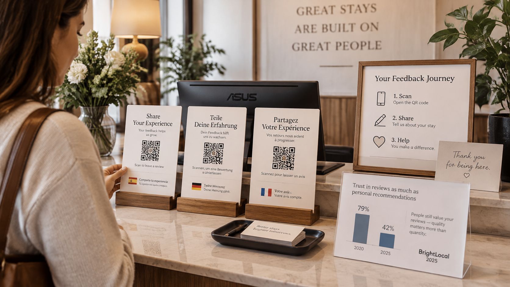
That puts a different job on the card. Accessibility gets the phone out. Transparency is what makes the resulting review worth reading. The private route matters more than most owners admit, because a guest with a problem who gets an answer on the spot usually never posts the complaint publicly.
Language handling helps with the first part and can hurt with the second. A page that appears in the guest's own language, across all 30 languages HolaQR supports, removes the comprehension barrier. What it should never do is imply that the review itself will be translated, published on every platform or treated the same way in every country. Say plainly where the review goes and let the guest decide what to write.
Three moves make the page trustworthy:
- Name the destination. The button should say Google or Tripadvisor, not "leave a review". A guest who knows where the words will land writes something more considered.
- Invite the guest's own words. Honest experience, in their language, in their phrasing. Don't suggest content or length.
- Offer a second door that stays open. HolaQR pages carry a WhatsApp button that sends questions and bookings straight to the business, with no commission to a booking platform, alongside review buttons for Google, Tripadvisor and Facebook.
That second door runs beside the public one. The review link stays open to every guest, and nobody gets steered away from it. A private route only earns its place when the public one stays untouched.
Before you print, read the page once the way a visitor from another country would. Check two things: does it say where the review goes, and does it say what happens next?
Track Results and Refine Each Month
Keep one sheet. That's the entire measurement system, and it takes ten minutes a week.
Each week, write down the number of new reviews and which card sat where. After four weeks, compare against the weeks before the cards went out. Read the counts in your Google and Tripadvisor accounts rather than anywhere else, because the card makes requesting easier but doesn't change how platforms count a review.
Once a month, walk the guest's path yourself. Scan the code on your phone, tap every review button, and switch the page into another language. Restock counter cards before the busy season rather than during it, and replace any card that's torn, faded or curling.
If reviews stall, change one thing at a time, in this order: move a card to a busier exit point, reprint a card whose line is unclear, then adjust the reminder window.
For a rough benchmark on request channels, GatherUp's 2025 analysis of 8,952 businesses found 11.8 reviews per 100 SMS-only requests, 12.9 per 100 email-only requests, and 13.5 per 100 requests when email and SMS were combined (GatherUp). That study didn't test review cards, so treat it as a channel comparison, not a target. If you already collect email addresses or phone numbers, a combined reminder alongside the card is likely to do more than the card alone.
One more thing worth logging: the time of day a scan turns into a review. Analysis of 22.3 million review requests that produced 2.3 million reviews found higher response periods around midday and early evening, with different patterns across product categories (RePEc working paper). Track scan-to-review conversion by location, time window and platform, and you'll know which of your placements is earning reviews.
Start Your First Review Card Today
Before you print anything, ask a guest to scan the code straight off your phone screen while you finish setting up the page. HolaQR is free and doesn't require a credit card, so there's no purchase decision to make first. You see the guest's view in ten seconds.
Three steps for this week:
- Build the page using the six-step routine, review links included.
- Place one counter card at your busiest exit point and leave it there for four weeks before judging it.
- Check every line against the safe column. Honest experience, no promised benefit, every guest asked.
Write down which card sits where, so next month's numbers can be traced to a placement instead of guessed at.
A plain Google or Tripadvisor review link printed on a card also works and needs no setup at all. The guest then has to find the business page first, and that's exactly where a share of them stop.
Place the card where guests already pause, keep the request neutral, and let every guest choose. Create your free review page and put the first card on the counter today.